Parallax Trilogy Titles/Covers Revealed
After two years of work on these books, the Parallax trilogy is coming down the home stretch!
As a part of that, we’re finally at the stage of creating cover art. Well, rather, we’re explaining to our publisher what we want the cover art to be and they’re creating it. But honestly, that’s way better. We could not draw spaceships and space stations to save our lives.
COVER ART
Our publisher, Aethon Books, as you can see, has a diversity of amazing art styles on their covers.
So when the process of cover design began, we asked Aethon about their experience having characters on their covers, especially if said characters are unknown (I mean, we’re not talking Batman here).
They told us what they’ve found is that characters work fine on covers, as long as it’s kept to 1-2 characters, and they remain consistent throughout the series.
Parallax has 5 or 6 protagonists throughout the trilogy whose heads you’re in at one point or another, but we’ve always had our two leads: Paige and Hemlocke, investigating a conspiracy from different star systems, as their threads gradually come together.
So we gave them a concept for Paige and Hemlocke for Book 1, and their artist actually did a pretty great job. But Aethon said (and we agreed) we could probably do better. Mostly, to have characters on the cover, we needed to set a scene on a planet, which meant the cover looked more “cyberpunk” than “space adventure.” And while people like cyberpunk, we were told for whatever reason, cyberpunk covers just don’t do as well as space-themed covers when getting people to buy books.
SO, going back to the original plan, Aethon asked us what images would best represent our books in the general “space adventure” category. And after some thought and consultation, we asked Aethon for the following:
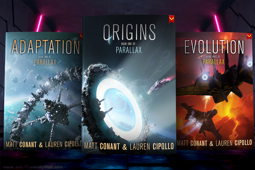
Book 1: A ship going into a jump point
Book 2: A ring-type space station
Book 3: Two ships chasing each other over a volcanic landscape.
INDIVIDUAL BOOK TITLES
Although it’s been called the “Parallax series” for two years now, we never bothered coming up with original titles for these books. Possible because they began as “Paige” and “Hemlocke” and once we wove them together, they merely became Book 1, Book 2, and Book 3.
But we figured one of the draws of this series when describing it to people is the gene-splicing theme. In Parallax, humanity has explored the nearest stars, but the corporations who run everything find that instead of terraforming, it’s easier to gene-splice their people to match the environments of the planets they encounter.
So we wanted our titles to reflect that. We went through a ton of options, including:
Invasive Species
The Variants
Terran Systems
Conspiracy of Splices
Off Grid
The Edge Worlds
Citizen Uprising
Systems of Control
Jump Point
Edge World Crisis
Humanity Spliced
Forced Speciation
Involuntary Speciation
The Disappeared
The Missing
and that was just for Book 1.
We eventually landed on a concept along the lines of:
Book 1: Humanity Spliced
Book 2: Humanity Shattered
Book 3: Humanity Evolved
for the trilogy.
And when consulting with Aethon, they loved the gene-splice angle, and together we decided to keep it simple.
Here’s a peak at the first one:
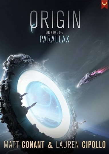
They gave us two designs for the Jump Point, but this was our overall favorite. It’s different from what you typically see for a “jump point” in sci-fi, and has a little bit of a “ring light” vibe, which I think is cool, as though it’s scanning the incoming vessel. The picture in our heads was a thinner ring, or concentric circles, but we just think this cover draws the eye better. We also love the moon intersecting the word “Origin” as it does, giving it a little extra spacey vibe without being too distracting.
Aethon’s first thought for our initial book title was “Genesis” but that felt a little too biblical for us. (Also, Aethon has a couple of other books called Genesis already.)
BUT, it put us down the right track…
Realizing our books portray a version of the next possible stage in Human Evolution, they took our ideas, followed the theme of genetics, and applied it to the other book titles, and suddenly it all fell into place:
Book 1: Origin
Book 2: Adaptation
Book 3: Evolution
We were happily surprised when each of our titles wound up having a little Darwin in them.
So, for the first time ever, to our Patreon backers only, here are our amazing new covers!
(Yes, for the keen-eyed among you, Book 1 will be called “Origin” as in the first image, not “Origins” – this was an early draft)
Aren’t these cool? We have to admit to admiring them for far too long.
OVERALL
We love everything about them.
Beyond the titles and artwork, many of Aethon’s books have blockier and more militaristic fonts, but the fact that the Parallax series is a little more heady and conspiratorial, this font feels classy and sophisticated.
They look like Chris Nolan or Alfonso Cuaron sci-fi instead of Roland Emmerich or Paul Verhoeven sci-fi. I love all those people, but with Parallax, we’ve definitely shot more for the former than the latter.
That said, there are still a lot of chase scenes and laser battles, so maybe I’m kidding myself, haha.
Now all we need is a couple of back-cover blurbs, and oh right, the tiny detail of editing of Book 3 – our editor is still reviewing the book – and perhaps some information on how any potential Audiobook might work…
And we’ll be good to go!
Release dates coming soon, everybody. Thanks as always for following.
Give us your thoughts on the covers below! We’d love to hear all of them. 🙂
Sincerely,
Matt Conant
Lauren Cipollo
Co-authors, Parallax
No responses yet